(for Michael Lancione & Jon Horsman)
Paul Bernier is an architect out of Montreal. His work is elegant and simple, with a strong attention to detail.
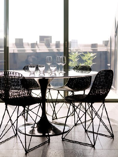
Lesson for Today: What I like most about this residence is the experience of its spaces. The garden feels very much like part of the interior due to its exclusivity and the large glazing on both sides of the house. The downstairs is spacious and public, making the most use of light as possible. The stairs are a strong feature in the house and are designed to let light filter down into the spaces below. As you assend to the upper floors you happen upon bedrooms and small hints of the exterior. Finally on the top floor you reach the climax of the house both in the amount of light let in and the freedom to go outside onto a rooftop patio. It's a wonderful experience.
Paul Bernier website: http://bernier.v2hosting.net/
Photography by Marc Cramer: http://www.marccramer.com/